

2stein
ViX Beta Tester
another skin, why? 
motivation:
- i have been using e2 for 15 years, and the main menu basically hasn't changed in those years.
however, my usage patterns have changed from just using dvb channels in one favorite bouquet to multiple bouquets with dvb and streaming channels. in addition i'm using more plugins for different purposes.
- the mainmenu list offers a huge set of items but i'm just using a dozen or so in the day-to-day usage.
so, i thought it would be handy to have those available on one screen reachable with less clicks.
in addition i was tired of the old aged list look and wanted to have a modern grid look that's standard on all streaming devices.
implementation:
i used DimitarCC's E2-DarkOS skin as a base and refactored it using Claude Code. with about 300 screens i wouldn't/couldn't have done it manually. it loosly follows Google's material style 3 rules.
highlights:
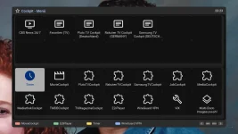
- the main change is the grid look. the whole mainmenu is displayed as a grid (there is no selection to change it to list).
- there is an additional home screen (when you press MENU), kind of a favorite screen, that contains links to bouquets, channels, menu items, and plugins.
- the mainmenu tree is reachable with MENU on the home screen.
here's the link if you want to try it: https://github.com/OpenCockpit/MaterialSkinCockpit
skins are a matter of taste. so, if you don't like it, it's ok., and if you have suggestions let me know.
and a last word: the skin still is in beta state... ;-)
motivation:
- i have been using e2 for 15 years, and the main menu basically hasn't changed in those years.
however, my usage patterns have changed from just using dvb channels in one favorite bouquet to multiple bouquets with dvb and streaming channels. in addition i'm using more plugins for different purposes.
- the mainmenu list offers a huge set of items but i'm just using a dozen or so in the day-to-day usage.
so, i thought it would be handy to have those available on one screen reachable with less clicks.
in addition i was tired of the old aged list look and wanted to have a modern grid look that's standard on all streaming devices.
implementation:
i used DimitarCC's E2-DarkOS skin as a base and refactored it using Claude Code. with about 300 screens i wouldn't/couldn't have done it manually. it loosly follows Google's material style 3 rules.
highlights:
- the main change is the grid look. the whole mainmenu is displayed as a grid (there is no selection to change it to list).
- there is an additional home screen (when you press MENU), kind of a favorite screen, that contains links to bouquets, channels, menu items, and plugins.
- the mainmenu tree is reachable with MENU on the home screen.
here's the link if you want to try it: https://github.com/OpenCockpit/MaterialSkinCockpit
skins are a matter of taste. so, if you don't like it, it's ok.
, and if you have suggestions let me know.and a last word: the skin still is in beta state... ;-)
Attachments
Last edited:
