Superb quality and spec AB-Com PULSe 4K SE. Crazy offer! Only £99! FREE UK DELIVERY! 4K UHD, Enigma 2, Multiboot 4 images & more!...
Superb quality and spec AB-Com PULSe 4K Rev II Twin Satellite tuner only £149! FREE UK DELIVERY! 4K UHD, Enigma 2, SATA HDD facility, Multiboot 4 images & more!...

Blue-HD V2

  • Thread starter Thread starter rossi2000
  • Start date Start date
Love it, couple of little things.
For Vu+ solo2 on Vix, the EPG rows set to 7 and not 8 as you advise as 8 doesn't look right, cuts bottom of text in boxes. 7 rows looks perfect.

When playing media from a NAS (network hard drive) the time gets cut off on info banner, it doesn't show the last digit. eg, (3.15pm 25 seconds) 15:10:25 shows as 15:10:2 yet shows correctly when playing media from internal hdd or watching a programme.

It would be great if the recordings list was taller so I wouldn't have to scroll down so much for recordings.

So far this skin is fantastic I have set it on both my vu+ boxes. Best sly blue skin by far. EPG looks really nice and clear, makes it easier to find stuff to watch, etc.
 
Love it, couple of little things.
For Vu+ solo2 on Vix, the EPG rows set to 7 and not 8 as you advise as 8 doesn't look right, cuts bottom of text in boxes. 7 rows looks perfect.

When playing media from a NAS (network hard drive) the time gets cut off on info banner, it doesn't show the last digit. eg, (3.15pm 25 seconds) 15:10:25 shows as 15:10:2 yet shows correctly when playing media from internal hdd or watching a programme.

It would be great if the recordings list was taller so I wouldn't have to scroll down so much for recordings.

So far this skin is fantastic I have set it on both my vu+ boxes. Best sly blue skin by far. EPG looks really nice and clear, makes it easier to find stuff to watch, etc.


Thanks for your input. I'm back tomorrow from working away. I will look at what you suggested and make the necessary adjustments and put out an online update. Cheers

Edit. Did you change the timeline font in the epg as well to -3? If so can I have a screenshot of the text problem with 8 rows. I thought I had it done perfect :-)
 
Last edited by a moderator:
Thanks for your input. I'm back tomorrow from working away. I will look at what you suggested and make the necessary adjustments and put out an online update. Cheers

Edit. Did you change the timeline font in the epg as well to -3? If so can I have a screenshot of the text problem with 8 rows. I thought I had it done perfect :-)
Followed your instructions to the letter on two vu+ solo2 boxes. using 8 lines means the space below the text in a box on the epg is much much thinner than the top and text slightly cut off. It looks perfect with 7 lines instead. Maybe this is box specific?

One other thing, the playback info bar is blue most time but during live pause two boxes appear, one for programme and one above it for the media play pause time remaining etc, not blue. Two boxes one on top of each other doesn't look as good as one box. I wouldn't know what to suggest but you have done an amazing job so I'm sure you will continue to do so.

the now and next Infobar shows now and next but description for programme on now only, not the next one. Also, on other skins it shows how many minutes of the current programme have passed in +mins and how many left in -mins. I like that I don't know about other users.

I would prefer not to see the name of the skin in the top left, Blue HD in use. I kinda like things understated but again that's just my preference.

Congrats again on this amazing skin.
I hope you continue to develop this and create others too, I love the layout of recordings showing in the middle rather than to one side like other skins.
 
yo

its not box specific, so i'll look at the EPG rows when i get back.

yes thats the timeshift bar that appears above the infobar, i have already changed this and it will be out in the next online update.

yep thats intended to show only the now programme, skys doesnt show next info afaik when i checked my sky hd box.


the skin logo is in the top left on the EPG as i couldnt get the picon to show at the time, when i can sort it, it will show the picon like the other screens. (nothing wrong with a little branding :) )


im trying to keep it close to sky as possible but still retaining some of the normal/vix things in it. there are so many ways you can do things. too hard to please everyone.

there have been quite a few changes since 2.0.8
 
Just a small bug I've picked up on.

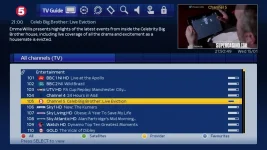
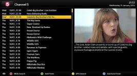
When in the channel list (1st pic) if the info button is pressed it brings up the 2nd image. The bar that highlights the channel has been changed but as you can see the background is black.

screen1.webp

screen2.webp
 
Just a small bug I've picked up on.

When in the channel list (1st pic) if the info button is pressed it brings up the 2nd image. The bar that highlights the channel has been changed but as you can see the background is black.

View attachment 31944

View attachment 31945
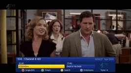


yup some of those screens still need to be skinned like the rest, some stuff im still deciding on the best way to do them, i dont want to rush in and then have to re-do them later. ive almost sussed the way i want those particular screens to look, just need to code them and sort the graphics.

some things that i do change will have a knock on effect to other screens as you can see from the yellow bar.
 
I love this skin and it passes the wife test as well. thanks so much. I have one request that might not even be possible. I love the info bar. it is identical to sky in look but not function. would it be possible to navigate only with the infobar. navigate up/ down to browse channel and left/ right for the epg. currently I press up and it changes channel. I want it to browse up without changing channel. if I press left it brings up another epg that has that function but looks completely different. very confusing for the wife. Then it would function exactly sly a sky box.

This is the same on all skins so it might need vix development. thanks for all the hard work.


This is the one I want to use for everything.
infobar.webp

This is the one I want to get rid of.
quickepg.webp
 
Last edited by a moderator:
hi,
thanks for your input.

ive looked at this at the beginning, unfortunatley i dont believe thats possible.
i looked at it at the begining of creating the skin.


i dont think it will get implemented, might be alot of work just for a skin, so it maybe not worth while.
 
is there a feature request section that we could add this to for other devs to jump on board?

I could never see the point in having two info-bars. would be a lot more intuitive to use.
 
You would need to ask Rossi2000 if its possible to skin it and if its worth his while to do so as most use the vix version of it.
 
virtual zap does the same as quick-epg doenst it?

Yep it does the same, the only difference is if you have a twin tuner virtualzap gives you pip on the infobar where the picons would normally be.

You can't see it in the screen shot but it does work.

vz.webp
 
Last edited by a moderator:
i have an idea!!

what would be good is if quick-epg can be made to work in reverse.
i could probably do the infobars properly then

quick-epg works = right/left change channel, up/down change epg

we need = right/left change epg, up/down change channel.
 
I am on version 2.0.8 is an update available yet?

Keep up the great work
 
later tonight, im just doing more work to the menu screens.


when updates are available, i will post here and also your infobar will flash with the update icon so you know theres an update.
 
later tonight, im just doing more work to the menu screens.


when updates are available, i will post here and also your infobar will flash with the update icon so you know theres an update.
I disabled the icon flashing as it wasn't working correctly on one of my boxes
I shall check here soon.
 

OpenViX Feeds Status

Back
Top