Rahat786786
New member
- Joined
- Apr 8, 2012
- Messages
- 369
- Reaction score
- 0
- Points
- 0
Also, what changes should be made like for the number of rows etc? The skin looks amazing btw!


The channel selection screen is perfect now!

Rossi, Simon, the new OnDemand screens look excellent, nice work.
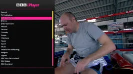
Not sure if ye're aware but presume ye are? when highlighting selections on some of the players, the text is pretty hard to read.
View attachment 34281
Yes, ye should be. Apart from my personal dislike of the non functioning icon bar in some screens, it's looking really good.We are both pretty happy with the way its going so far and wanted it share it now
Can you add padding on some screens? if not, reduce the look of some graphics?
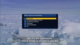
Also, some screens don't have nicely rounded edges in their titles so look a bit harsh.
View attachment 34282

Please have a look at Magic-HD: I think I skinned all screens.Also more work to be done if we can access the screens after the menus. so we can brand in everything in together and offer a better ondemand interface.
Can you add padding on some screens? if not, reduce the look of some graphics?
Also, some screens don't have nicely rounded edges in their titles so look a bit harsh.
View attachment 34282
Please have a look at Magic-HD: I think I skinned all screens.